Ad Creative Design with AI Workflows That Ship
Practical ad creative design guide using AI templates, product photo enhancement, URL to UGC video, and background replace workflows for performance marketers.
By Nim
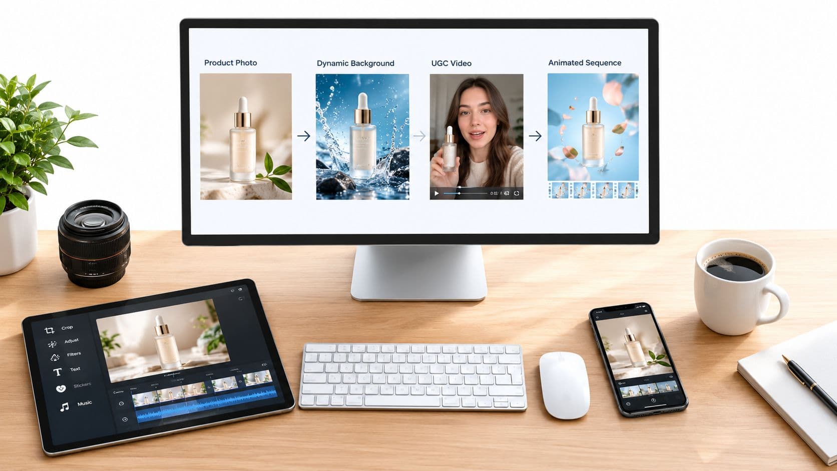
A product team can spend hours polishing one banner, launch it, and still have no clear idea whether the problem was the image, the offer, the copy, or the audience. That's the central weakness of one-off ad creative design. A better workflow turns one verified product asset into several controlled image and video variants, then evaluates each against both performance and diagnostic signals.
Nim supports that production process through UGC Ads templates, URL to UGC video, Enhance Product Photo, and Background Replace. The important distinction is not generating more creative. It's creating variants that differ for a reason, while keeping the product, offer, and audience consistent enough to learn from the comparison.
What Ad Creative Design Looks Like in a Nim Workflow
Effective ad creative design starts with one communication objective. The objective might be recognition, message comprehension, or action. Once that objective is fixed, the production task becomes easier to judge. A clean product hero may be right for recognition, while a use-context scene may do more to explain an unfamiliar product.
The four Nim entry points solve different parts of that system:
- Enhance Product Photo strengthens the core product asset so the item is clear, accurate, and usable across placements.
- Background Replace changes the setting behind the same product, allowing a studio treatment to be compared with a realistic use context.
- UGC Ads templates turn product imagery into short-form ad concepts designed for vertical social placements.
- URL to UGC video uses a product page URL as the starting point for a talking-head style asset, which can communicate a benefit in a more conversational format.
The workflow works best when each output has a testable role. A clean hero tests product prominence. A lifestyle scene tests context. A motion treatment tests whether movement improves attention without weakening comprehension. A talking-head concept tests whether a spoken-style explanation adds credibility or creates distraction.
Teams building a repeatable pipeline can also review this guide to ecommerce creative production with AI for broader planning ideas. The practical output should be a small, documented set of variants, not an untracked gallery of attractive images.
Practical rule: Every prominent element should explain, demonstrate, differentiate, or direct. If it does none of those things, it's a candidate for removal.
By the end of the workflow, the marketer should have source assets prepared for multiple placements, three or four distinct image concepts, two or three motion concepts, and a review checklist covering hierarchy, authenticity, message clarity, and the primary conversion objective.
Preparing Product Photos That Survive the Pipeline
A weak source image limits every variant you make in Nim. If the original photo has inaccurate color, soft edges, glare that hides the label, or a crop that cuts off the package, those defects show up again in every downstream format.
Start with a clear product view that shows shape, material, packaging, and any markings a buyer needs to read. Keep the color faithful to the item being sold. If the product has a label, dosage, capacity, or distinctive feature, that detail should stay legible for the placement. A generated scene can improve composition, but it should not change a product claim or physical feature.
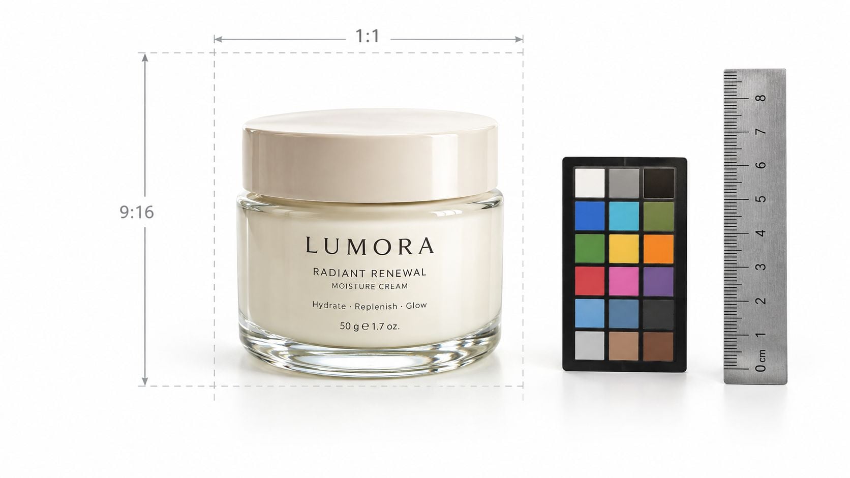
Prepare for the placements before generating
Vertical placements typically need 9:16 orientation, at least 720p resolution, and composition that keeps key details inside the safe zone. Short-form placements also reward sound or music and fast value delivery, as outlined in the official creative guidance. Keep prices, calls to action, and product copy away from the edges so interface elements do not cover them.
Horizontal display assets usually need a different crop strategy. Responsive display placements commonly call for 1.91:1 images at 1200 × 628 pixels, with a 600 × 314 pixel minimum, and square 1:1 images at 600 × 600 pixels, with a 300 × 300 pixel minimum. Those requirements are listed in Google's responsive display asset requirements.
Before opening a Nim workflow, prepare:
- A clean hero angle with the product prominent.
- A second angle that reveals scale, use, or packaging depth.
- A vertical-friendly crop with room around the subject.
- A wider crop suitable for horizontal display composition.
The product should not sit so close to the edge that a crop removes the cap, handle, or label. For a practical reference on sourcing and formatting ecommerce imagery, see product images for ecommerce. This preparation is simple, and it prevents a common failure, asking one tightly cropped image to do every job.
Generating Product Ad Variants That Differ in One Variable
The production core is controlled variation. A recolored background and a slightly different shadow may create two files, but they don't necessarily create two useful tests. Each variant should change a meaningful creative dimension while preserving the offer and target audience.
Begin with Enhance Product Photo to create two still foundations. The first should be a restrained hero shot, with a clean background, strong product visibility, and minimal supporting detail. The second can be a richer styled shot that introduces one deliberate cue, such as a bathroom setting, a serving context, or a material that reinforces the product's use.
Next, use Background Replace to create a context comparison. Keep the same product and proposition, then place it in a realistic use environment for one version and a controlled studio setting for another. The question isn't which background looks more expensive. It's whether context helps the viewer understand why the product matters.
A useful production record might look like this:
- Variant A: Clean hero. Tests immediate product recognition.
- Variant B: Styled product scene. Tests whether one contextual cue improves comprehension.
- Variant C: Use-context scene. Tests whether the environment makes the benefit more concrete.
- Variant D: Product-led motion treatment. Tests whether movement increases attention without reducing clarity.
The offer, audience, and landing experience should remain constant wherever possible. If the headline, discount, product, and visual treatment all change together, the result may reveal a winner but won't explain why it won.
Choosing a Product Ad Variant Type
| Campaign Goal | Variant Type | What Changes Between Variants |
|---|---|---|
| Build recognition | Hero-first | Product scale, contrast, and brand linkage |
| Explain usage | Context-first | Environment and product-use cue |
| Make a tangible benefit visible | Demonstration-led | Product state, interaction, or motion |
| Support a promotion | Offer-led | Copy hierarchy and relationship between product and offer |
The strongest version depends on the offer. A familiar commodity may benefit from immediate product prominence. An unfamiliar item may need context before the viewer understands its function. The workflow should produce both when the team is uncertain, then test the creative question directly instead of choosing based on personal taste.
Building Short-Form Video with UGC Ads and URL to UGC Video
Still images can establish the product, but motion gives the creative another variable to test. In Nim, UGC Ads templates can turn a product source into short-form ad concepts, while URL to UGC video starts from a product page and creates a talking-head style asset. The two routes answer different needs. The first is product-led production, while the second is useful when the page already contains the approved product information and benefit language.
Open the relevant UGC workflow and provide the product source or product URL requested by that template. The source should match the factual product being sold. If the product page claims a specific feature, the generated video should preserve that claim accurately rather than turning it into a stronger promise.
Keep the motion test controlled
Create one variant with a direct product reveal and another with a use-context opening. A third can test a different pacing pattern while keeping the offer and message stable. The point isn't to make every video dramatically different. It's to isolate whether the opening visual, product demonstration, or rhythm changes the response.
For vertical placements, compose the product and essential message inside the central safe area. Interface overlays can obscure text, pricing, and calls to action near the edges. The source image should be framed vertically before animation so the product doesn't become a small detail inside a wide scene.
A talking-head style asset can make a benefit easier to process, but it can also introduce a trust problem if the presentation feels synthetic or over-polished. Preserve the visible attributes of the product and review every frame for altered packaging, shape, or unsupported claims. For additional practical guidance on short form video editing tips, the useful focus is pacing, safe composition, and message priority rather than adding effects for their own sake.
The relevant AI UGC video generator workflow can help teams move from a product source to a motion concept, but the generated output still needs human review. A polished video isn't automatically a persuasive one.
Running a Clutter and Hierarchy Review Before Launch
A crowded ad slows the viewer down before the offer lands. Research that combined eye-tracking experiments with a large real-world panel found that a one-standard-deviation increase in digital ad clutter was associated with as much as an 85% reduction in average conversion probability across campaigns, as reported in this research summary.
That does not mean every clean ad wins. The better review is a side-by-side judgment of a restrained version and a richer version. The richer version may carry context, motion, or depth. The restrained version may make the product easier to grasp in the first second. Judge both on message understanding and brand connection.
Use a five-step reduction pass
- Identify the subject. Mark the one product or visual subject that should get attention first.
- Remove unsupported decoration. Delete shapes, particles, props, and effects that do not explain, demonstrate, differentiate, or direct.
- Set one focal point. Make sure the product, face, or demonstration has stronger visual priority than the background.
- Shorten the copy. Keep only the words needed to understand the proposition at the actual viewing size.
- Inspect mobile scale. Review the creative at the size where the audience will see it, not only on a large design canvas.
Complexity is not automatically a problem. Eye-tracking analysis of 249 advertisements found that feature complexity weakened attention to the brand and ad attitude, while some forms of deliberate design complexity improved attention, comprehensibility, and attitude, according to the same analysis. The practical difference is functional hierarchy. One purposeful cue can add meaning. Several competing cues create uncertainty.
For video, Nim's AI video background remover can help isolate the subject when the original scene fights the message. Review the output for edge quality and product realism before it ships.
Review question: Can a viewer identify the product, understand the promise, and connect both to the brand without reading every word?
Evaluating Variants Without Trusting a Single CTR Winner
A CTR leader can still be the wrong creative. It may attract curiosity, pull accidental clicks, or resonate with a different audience mix than the variant beside it. It also says nothing clear about persuasion, brand memory, or purchase intent.
Use monadic testing logic wherever possible. Show each respondent or audience exposure one ad concept at a time, rather than asking people to compare several versions side by side. Standard monadic ad-testing workflows often support up to 10 image concepts and can return scorecards, benchmark comparisons, statistical significance, and key-driver analysis.
Keep the test conditions fixed in platform experiments. Hold the offer, audience, placement, landing experience, and primary promise constant. Change one visual dimension, such as the opening image, product prominence, background, or demonstration. Then review the primary KPI with diagnostic measures such as brand linkage and message clarity.
AI-assisted screening can narrow the candidate set, but it should not replace human response. Recent industry research on AI-assisted creative screening found that AI-based screening delivered a meaningful lift over doing no research, while still falling short of the value of human responses, as summarized in the American Marketing Association's discussion of AI advertising research.
The defensible winner is the concept that meets the primary objective without giving up clarity or trust. A file with the highest early CTR is only useful if it also carries the message and links back to the brand.
Your Production Checklist and Next Workflow
A repeatable ad creative design process fits on one campaign checklist.
- Prepare the source: Verify product shape, color, packaging, edges, and readable claims.
- Plan placements: Create crops that can work in vertical, square, and horizontal formats.
- Build still variants: Use Enhance Product Photo for a hero image and a styled treatment.
- Change context deliberately: Use Background Replace to compare studio and use-context scenes.
- Create motion options: Use UGC Ads templates for product-led short-form concepts.
- Test the URL route: Use URL to UGC video when a product page is the right source for a talking-head asset.
- Review hierarchy: Remove decorative elements, shorten copy, and inspect at mobile size.
- Evaluate responsibly: Compare the primary KPI with brand linkage, message clarity, and real audience feedback.
Creative quality often drives a large share of ad effectiveness, which is why production capacity belongs in performance strategy. One polished concept leaves less room to learn than several materially different, carefully reviewed options.
Start with one verified product image, create a clean hero and a context variant, then turn the stronger message into a vertical motion concept. Nim provides workflows for those product image and short-form video tasks, so the process can move from source preparation to review without treating every asset as a separate design project.
- ad creative design
- AI ad creative
- product photo ads
- UGC video ads
- performance creative