AI Interior Design Guide: What Visuals Can and Cannot Show
Learn how AI Interior Design works for room visuals, from virtual staging to lighting tests, and where generated images stop being accurate.
By Nim
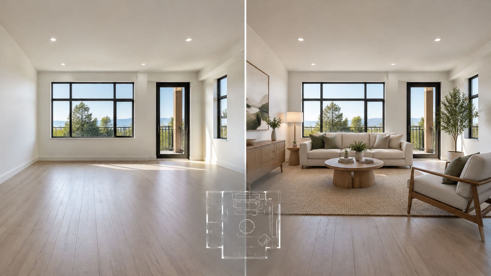
The money moving into AI interior design isn't a lifestyle trend with a nice render attached. Grand View Research valued the global AI-in-interior-design market at USD 3.3 billion in 2025 and projects USD 15.0 billion by 2033, a 20.9% compound annual growth rate from 2026 to 2033, with North America holding 38.6% of the 2025 total. A second estimate from HTF Market Insights puts 2025 at USD 2.5 billion rising to USD 8.5 billion by 2033, which tells you how loosely the category is defined rather than where it's heading.
All that spend buys pictures. A generated room carries mood, palette and furnishing direction well, and it carries measurements, fixture positions and existing defects badly. Whether that matters depends entirely on what the image is asked to prove.
The distinction that resolves most disputes is simple. Design communication shows what a room could become. Property documentation records what a room is. Generated visuals are excellent at the first and unusable for the second, and the checks in this guide exist to keep the two from being confused in front of a client, a buyer or a listing platform.
What AI Interior Design Produces and Where It Stops
Homeowners now arrive at a first meeting having already generated a version of their own living room, and that image becomes the reference point a professional proposal gets judged against.
Professional use is narrower and more cautious. An industry survey reported by Globe Market Research found 82% of surveyed global interior-design professionals using AI regularly, with pre-project visualization the leading application at 74% among those using AI for planning and design, ahead of mood boards at 44%, floor plans at 41%, product or material recommendations at 33%, and photo analysis or tagging at 22%. Samples and definitions differ across surveys, so read the ranking as indicative rather than exact.
That ranking is the honest job description. AI earns its place at the front of a project, where being wrong costs a second concept rather than a change order. The table below sets out what five common tasks deliver.
| Task | What the output shows | What it does not prove |
|---|---|---|
| Mood and style exploration | Possible palette and furnishing direction | Room dimensions or construction feasibility |
| Virtual staging of a room photo | The existing room furnished in a proposed style | Actual condition of fixtures, finishes or defects |
| Lighting and time-of-day variants | Alternative visual light conditions | Photometric performance of real fixtures |
| Plan to 3D render | A rendered view suggested by a floor plan | A dimensionally accurate plan |
| Property documentation (defects, measurements, condition) | Not a supported use | Any of these facts |
The AI-generated illustration below shows the kind of transformation virtual staging produces: an empty room restyled as a furnished one.
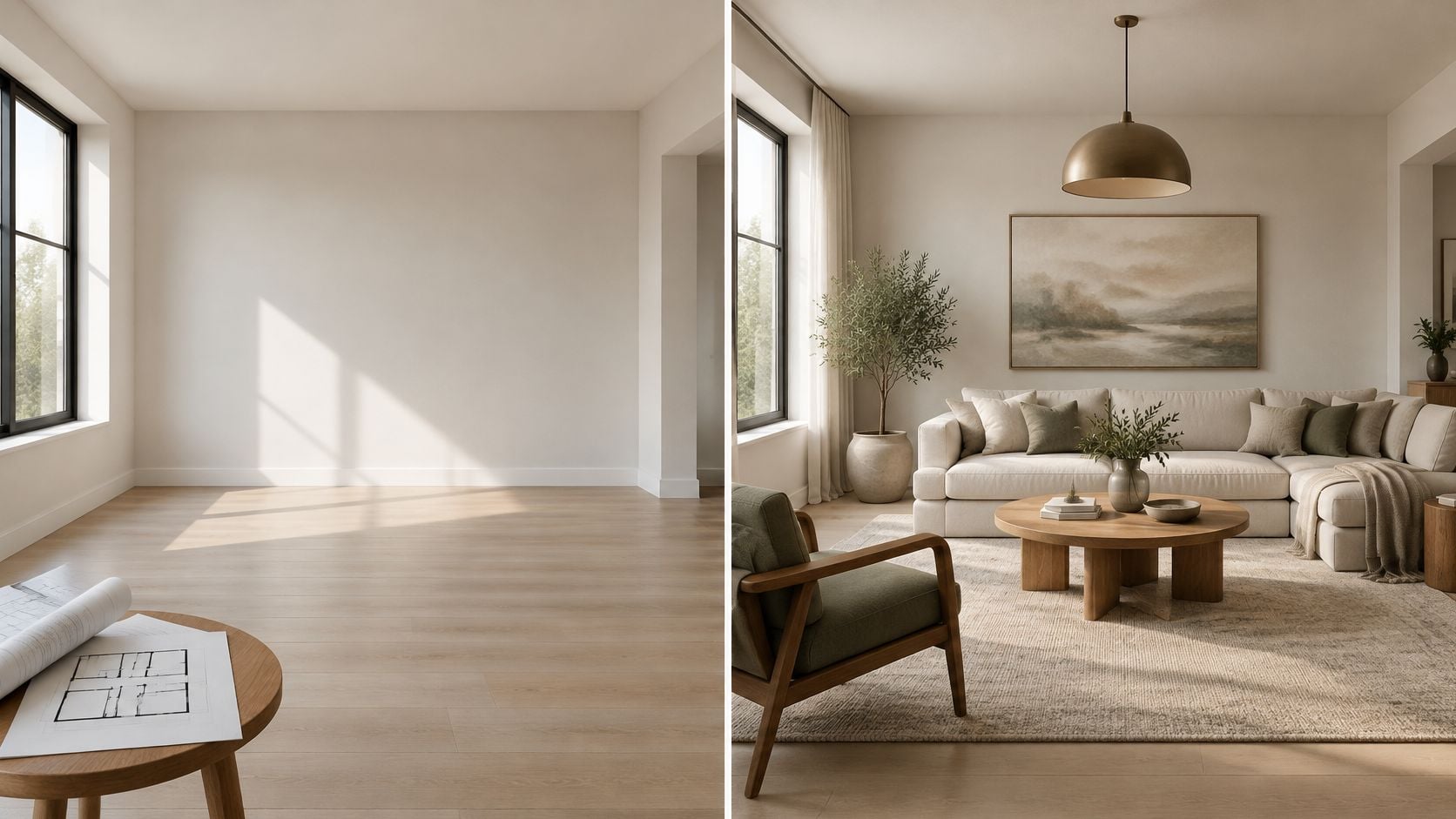
What a generated room is worth
A generated room is a concept sketch with a photographic finish. It shows a plausible palette, a furnishing direction, a light condition worth building toward. What it cannot carry is a measured space or the state of what is already in the room, and that limit holds no matter how convincing the finish looks.
The working rule: if a sentence about the image needs the word "approximately" in front of a measurement, the image is the wrong document for that claim.
Nim's Virtual Staging template takes a room photograph into a furnished concept, and Plan to 3D produces a rendered view suggested by a floor plan. Both are presentation tools. Both need a manual pass before anyone treats the result as a record of the space.
Generation comes last in the process. Before a template opens, the room needs a brief: what it is for, who uses it, what cannot move. A plain walkthrough of how to begin designing a room covers those questions, and the answers are what keep a generated concept attached to a real building.
How Accurate AI Room Visuals Really Are
A generated room can look unmistakably like your living room and still relocate a window. Those are two different kinds of accuracy, and published evaluations measure mainly the first. In a Springer study comparing generated room images with reference images, viewers identified the intended space correctly in 76% of evaluations for generated images, against 66% for the reference-image benchmark, and recognised the intended ambiance in 25% of evaluations, against 18% for the benchmark.
| Measure | Generated images | Reference images |
|---|---|---|
| Intended space identified correctly | 76% | 66% |
| Intended ambiance conveyed | 25% | 18% |
Two things follow from those rows. Viewers placed the room's identity far more often than its mood, and generated images outscored the reference photographs on both counts, which means a render can be more legible than the truth it depicts. Both rows measure recognition: what an image communicates to an audience. They carry no weight as proof of geometry.
Fine-tuning lifts the visual ceiling without closing that gap. A Springer chapter on fine-tuning generative models for interior imagery reports Fréchet Inception Distance falling from 3.296 to 2.579 on ADE MIT and from 5.472 to 4.429 on an interior dataset after fine-tuning. FID measures how closely the distribution of generated images resembles the distribution of real ones. It says nothing about whether a window moved two metres to the left.
The four failure points to check by hand
- Furniture scale: a sofa that reads as elegant in the render can be 40 cm too long for the wall once you measure it. Compare the piece against the door frame and the window sill in the source photograph.
- Window and fireplace positions: these are the first things a viewer uses to orient themselves in a real room, and the first things a model relocates. Count the openings in the source and match them one for one.
- Wall lengths and ceiling heights: generated images stretch rooms to fit a composition. If a client reacts to the spaciousness, check what got lengthened before the conversation continues.
- Finishes: flooring, joinery and paint are invented far more often than furniture. Anything that looks like a permanent fixture is a claim about the property.
Treat a render as a styling and presentation layer, then inspect placement, light direction, openings and finishes against the original photo before anyone relies on it. The same scepticism applies when a render sends you shopping: an online furniture shopping guide for remodelers is the practical check on whether the piece you liked exists at the size you need. Photo-to-3D conversion carries the same blind spots, and the image to 3D guide covers what that step can and cannot support.
Prepare Incomplete or Ambiguous Room Inputs
Most real inputs are bad. A cluttered spare room shot on a phone at chest height, a cropped plan from a listing, a rental where nothing can be drilled into a wall. The work that decides the output quality happens before any template opens, and it's mostly writing down constraints.
A study of professional adoption found generally positive attitudes toward AI alongside low early uptake and continuing concern about unsupervised human-AI co-creation. A designer liking the tool is not the same as a designer trusting its output, and the six cases below are where that gap shows up.
- A cluttered photo. List the movable objects first and limit the requested change to furnishing. Running the image through Virtual Staging with windows, doors and wall lines anchored to the source keeps the room recognisable; a full restyle invites the model to rebuild the architecture as well.
- An awkward or cropped angle. Record the tilt or crop, then ignore furniture scale in the result. Perspective distortion makes a plausible-looking chair into a measurement you'll regret repeating to a client.
- A partial floor plan. Use Plan to 3D as a suggested view only, and mark every dimension unverified in whatever you send out. A partial plan produces a partial idea of a room, and the gap gets filled with invention.
- A room with no obvious function. Name the job. "Home office for two people, one video call at a time" generates a usable concept; "spare room" generates a generic bedroom nobody asked for.
- A rental or an accessibility requirement. State the hard limits up front, such as no wall removal, a door swing that stays clear, and a route through the room that doesn't depend on the sofa moving. These constraints belong up front, not in a note after the fact.
- A culturally specific room. Name the materials, floor seating or cooking equipment rather than one broad style word. A single adjective like "rustic" carries a different set of objects in every region, and the model will pick the one it has seen most.
Better output comes from a clearer source, not from a longer prompt. Reviewing the image, the constraints and the intended use beats adding adjectives.
When you have a clean, level, well-lit photograph of the whole room, use it. When you have one of the six cases above, the constraint list does more work than the photo does. If the room is being prepped for a sale, the home staging tips guide covers the physical decluttering that happens before the camera comes out, and the first steps in room design covers the functional brief that should exist before any of it starts.
How to Stage a Room Photo in Nim
A staged room image works as design communication: a proposal for a client, a mood test before a scheme is chosen, or a draft to review while a listing is being prepared. Treat it separately from property documentation. The source photograph remains the record of the room; the generated image shows one possible furnishing scheme.
Keep the untouched source photo beside the generated concept during review.
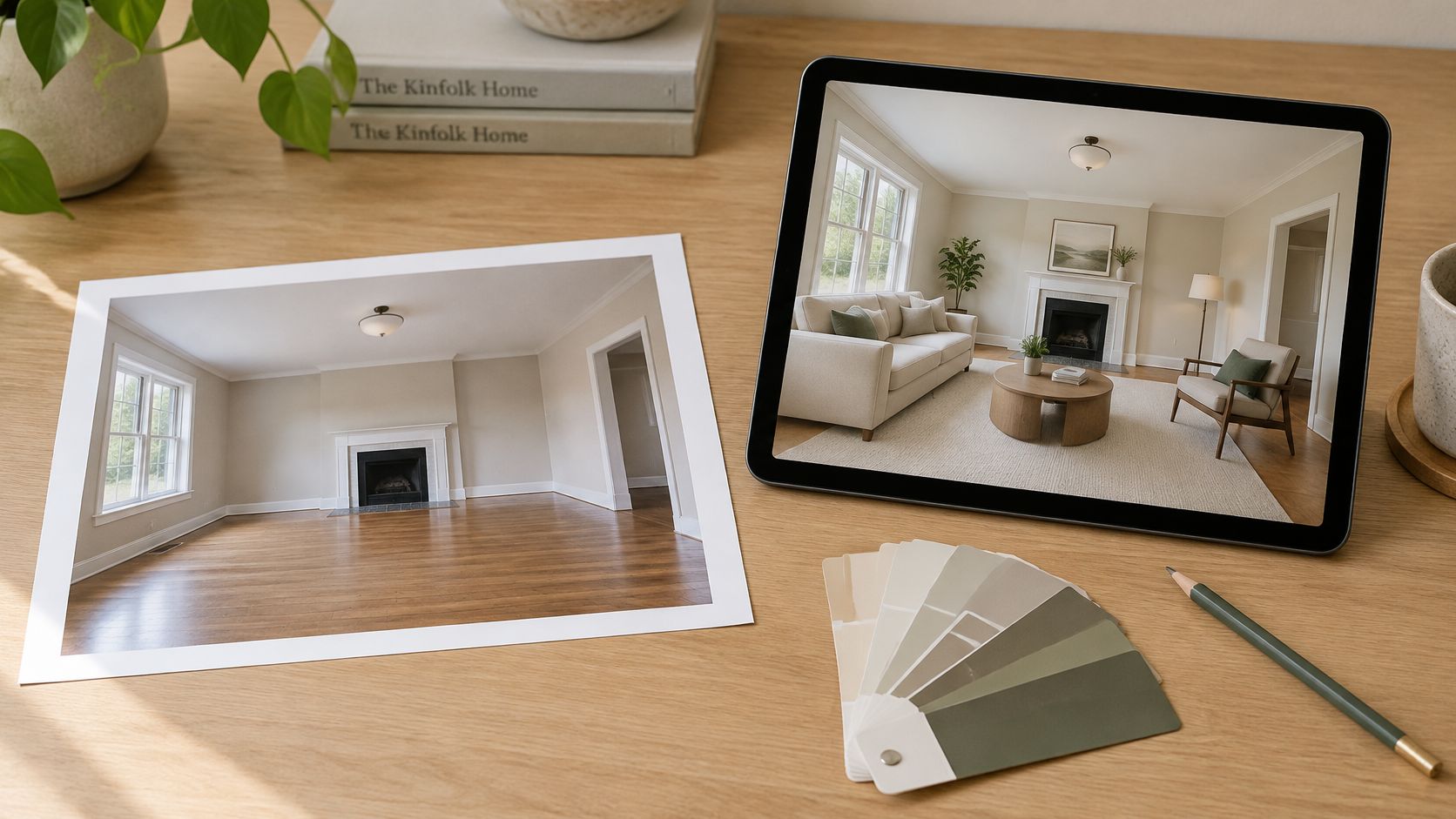
AI-generated illustration of the staging concept review.
Prepare the input before opening the template
Use a straight-on, level photograph with the whole room in frame. A tilted photo puts the floor line at an angle the model has to guess about. Move obvious clutter where practical, open the curtains, and turn on the lights so the source is not a dark rectangle. These are photographic choices, not settings in the tool, and they do more for the result than wording.
The staging routine
- Decide what must stay fixed. Windows, doors, the fireplace, ceiling height, and anything structural. Write the list down before generating; you will compare against it in step five, when a polished image can make details easy to misremember.
- Open the Virtual Staging template in Nim. Follow the input it requests.
- Provide the prepared room photo. Do not add settings the template does not ask for, and do not substitute a render of a different room.
- Generate the staged version. Review the first result as a proposal, then regenerate if the interpretation is drifting in the wrong direction.
- Compare it with the source photo, opening by opening. Check that the windows land in the same place, the door swing reads the same, the wall lines run where they ran, and the ceiling height is plausible. An attractive visual must be distinguished from a room that has been accidentally redesigned.
- Mark every invented change on a review copy. Added downlights, a widened window, a shortened wall, or a fireplace that appeared. The list is for deciding whether to regenerate.
- Regenerate or change the concept if the structure moved. Keep the source file untouched alongside the result so the comparison remains possible months later.
Acceptance criteria: structure unchanged and furnishing plausible at the room's visible scale. If either fails, correct the concept before the visual leaves the review file.
The comparison step is the one people skip, and it is the one that matters. A staged image can be attractive and still be wrong about the room; the error is invisible to anyone who has not stood in the space. The door frame is your ruler, the window sill is your second ruler, and both are in the source photo.
Testing Lighting and Mood Without Rebuilding the Room
Lighting is where generated interiors look most convincing and lie most often. A warm evening scheme with glowing lamps reads beautifully and tells you nothing about whether the room will feel like that at four in the afternoon in February. Showing the same room under two or three different conditions is the fix, and Nim has separate templates for it: Sunlight and Day and Night.
The reference values worth briefing against come from residential lighting practice. A U.S. Department of Energy residential lighting strategy guideline recommends specifying fluorescent and LED lamps at 3000 K correlated color temperature and a color-rendering index of 80 or higher for high-performance residential lighting. Those are design targets for a warm, natural-looking home, not proof that a generated image reproduces a real installation.
| Lighting target | Reference value | What to check in the output |
|---|---|---|
| Warm residential light | 3000 K correlated color temperature | Wood tones and flooring look plausible |
| Color rendering baseline | Color-rendering index of 80 or higher | Paint and upholstery colors read correctly |
| Window light direction | Matches the window openings in the source photo | Shadows fall consistently with those openings |
Write the brief in plain language
A usable lighting instruction reads like this: "warm residential LED appearance, neutral white walls, late-afternoon window light from the left." It names a color temperature in words a client understands, fixes the wall treatment so the palette doesn't drift, and states the direction of the light source. Vague language such as "cosy" or "moody" produces a mood and nothing checkable.
Then inspect the result in a fixed order. Flooring first, because a wood tone that shifts from oak to walnut changes the whole scheme. Paint next, since a neutral that turns cream makes every other decision look wrong. Upholstery and wood tones last, side by side with the source photo.
Practical check: if the shadows in the render fall from a direction with no window behind them, the lighting concept is decorative rather than spatial, and it shouldn't be used to justify a fixture plan.
The hard limit is worth stating plainly to clients. A generated image can't replace photometric calculations, fixture specifications or an on-site assessment, so any decision that affects how the room performs needs a designer or lighting professional to confirm it. What the image does well is give a client two or three variants to compare for mood, so the conversation moves from adjectives to choices. For a deeper look at controlling that variable, the sunlight for home guide covers the practical side of working with natural light.
Label Document and Publish AI Room Visuals
Ownership and disclosure are two separate checks, and both happen before an image leaves the folder. The Congressional Research Service analysis of the Copyright Office's AI guidance treats human creative control as the test: a prompt alone doesn't establish ownership, and protection covers only the human contribution, meaning the selection, arrangement, modification and compositing decisions a person made. For the publication folder that reduces to one requirement: keep a written record of what a person decided and changed, because that record is the contribution the law can protect.
Keep four things together for every project: the original room photograph, every generated version, the selected output, and a record of the edits a person made. That folder answers an ownership question, a client question and a listing-platform question at the same time.
The publication pass
The structural check already happened during staging, when openings, fireplaces and wall lines were matched against the untouched source rather than the previous render. What remains is a shorter pass aimed at the viewer rather than the file.
- Check the furniture fits the visible proportions. A bed that overlaps a doorway in the image will be a problem in the room.
- Confirm light direction and color agree with the openings. Shadow direction is the easiest spatial error to catch, and the easiest to miss when the image is attractive.
- Remove invented fixtures and finishes. Anything a buyer could mistake for an existing condition goes, or gets marked explicitly as proposed.
- Label the file. A short line such as "AI-generated visualization of a proposed design" tells the viewer exactly what they are looking at.
- Follow the local listing and advertising rules when a real property photograph was materially altered, and keep the unaltered original on file. Digitally altered listing images may require disclosure in some markets, while changing the property itself rather than adding temporary furnishings can amount to misrepresentation, as Real Simple's coverage of AI in interior design sets out.
The safe sentence to give a client: this shows a direction for the room, and the measurements and existing conditions come from a site visit, not from the picture.
Test the whole routine on a room you know well before it goes near a listing. Run that source photograph through one of the interior design templates, set the result beside the original and write down what the tool invented: a shifted door, a deeper window sill, a ceiling that gained height. That list of recurring inventions is what you check first on every real project.
Nim turns a room photograph or a floor plan into a furnished visual you can review against the source, with templates for virtual staging, sunlight and day-to-night studies, and plan-to-3D concepts. Start with a room you know by heart, run it through a concept, then check every opening and wall line yourself. Visit Nim to run that first comparison and see where the visual stops and the site visit begins.
- ai interior design
- virtual staging
- AI room visualization
- interior design visuals
- AI home staging