Change the Lighting in Nim Images and Walkthroughs
Learn how to change the lighting in images and walkthroughs with Nim's Sunlight and Day and night templates, plus how to check the result.
By Nim
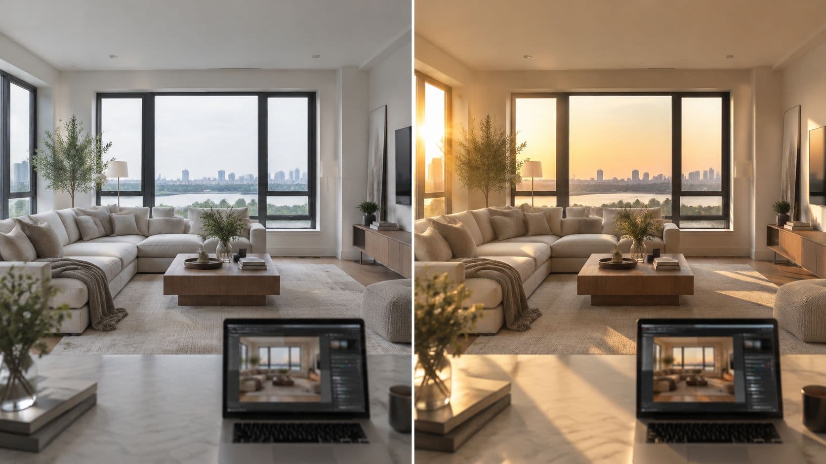
A room photo has the right furniture and framing, but the window looks washed out and the interior feels flat. To change the lighting in Nim, an editor starts with a clear target, selects the relevant lighting template, provides the input it requests, and compares the result against the original. A believable edit changes the illumination without changing the room, the product, or the way shadows behave.
Pick the Lighting State Before You Generate
The main targets are daylight, a warm evening interior, and night with interior lights on. Before opening a template, the editor should write the intended result in a plain sentence: late-afternoon warm light entering from the left, with the ceiling and trim remaining neutral. That gives the result a visible standard to meet; a request for a brighter room doesn't specify direction, warmth, or shadow character.
Color temperature supplies useful reference language, not a guarantee of accurate illumination. Nikon's white-balance guide describes lower Kelvin values as redder or yellower and higher values as bluer, with tungsten near 3,200 K and direct sunlight near 5,000 K.
| Target state | Typical light character | Reference color temperature |
|---|---|---|
| Daylight | Midday sun with crisp, pronounced shadows | Direct sunlight about 5,000 K |
| Open shade or late-day | Softer light, with a bluer cast in shade | Shade about 7,000 K |
| Warm evening interior | Lamps and tungsten glow | Tungsten about 3,200 K |
| Night with interior lighting | Dark exterior with lit interior | Match the dominant interior lamps; tungsten is a warm reference |
The sunlight and shade references above are also described in this natural-light photography guide, which places direct sunlight near 5,000 K and shade around 7,000 K. Late-day sunlight shouldn't automatically be treated as blue shade; its direction and warmth need separate description.
Match the state to the task
The Sunlight template is the relevant starting point for apparent natural-light changes to an interior or design image. Day and night fits a daylight-to-evening transformation.
For portraits included in a scene, editors can compare lighting setups for professional headshots to make the intended facial shadows more explicit.
Target rule: The output illustrates an intended lighting state. It isn't a measured lighting simulation or a record of the room's real conditions.
Prepare a Source Image That Holds Its Light
A clean source makes the intended change easier to judge. Window detail, straight edges, and readable shadows give the editor reference points; a blurred room with blank windows provides little evidence against which to assess a generated result.
Capture the room before correcting it
A practical interior capture follows this sequence:
- Stabilize the composition. A tripod keeps the camera position fixed while exposure changes. The camera should remain level so vertical walls don't lean unnecessarily.
- Expose for the room. Adobe's real-estate photography guidance recommends approximately f/8, shutter speeds from 1/60 to 1/2 second when light is limited, and ISO below 400.
- Protect both extremes. A darker frame should preserve the exterior through the windows, while a brighter frame reveals shadow detail. Any exposure blending belongs in source preparation, not an assumed Nim control.
The cleanest base isn't necessarily the brightest one. It's the image that preserves useful information without making the room look muddy or leaving the window completely featureless.
Resolve mixed light
Daylight through a window and warm lamps can leave different parts of the same white wall looking blue and orange. A global correction may improve one area while making another worse. For a daylight target, switching off interior lamps simplifies the capture; when lamps remain, the editor should choose a dominant source and inspect ceilings, trim, and walls individually.
The source-selection checklist stays concrete:
- Visible sources: Windows and lamps aren't hidden behind clutter or cropped into ambiguous fragments.
- Sharp boundaries: Door frames, furniture edges, and floor junctions remain easy to compare.
- Neutral references: White or gray objects retain enough detail to reveal unwanted color shifts.
- Consistent framing: Exposure alternatives show the same room from the same position.
Seasonal lighting references also need care. Timeanddate's daylight-saving explanation describes a clock change that shifts usable daylight toward evening, not a physical change in sunlight itself. A seasonal visualization should therefore specify the intended daylight conditions rather than rely on a clock label alone.
For a product-design concept shown inside the room, Genpire's overview of AI tools for product design provides broader workflow context. The immediate priority remains source quality: a weak exposure or unresolved mixed light is better recaptured than repeatedly regenerated.
How to Change the Lighting in Nim Step by Step
The workflow should stay specific to the selected template. Exact input requirements and available controls must come from its current form, not from an assumption that all templates work alike.
The following illustration shows the comparison task, not a verified Nim interface or output.
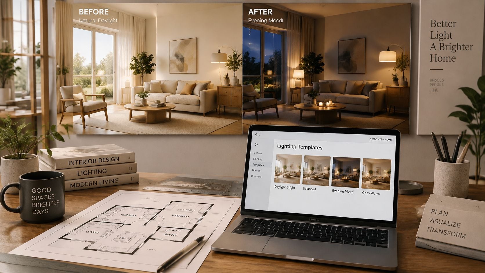
Run a controlled lighting change
-
Choose the matching template. Sunlight suits the natural-illumination task; Day and night suits the daylight-to-evening task. The editor should confirm the requested input on the selected page, because a relevant example doesn't establish every available control.
-
Provide the prepared source in the requested form. The selected image should retain the room's visible boundaries and useful window detail. A source with an already established light direction gives the editor a clearer basis for assessing the transformation.
-
Describe the target only if a text field is available. A useful description identifies direction, time of day, and warmth, such as late-afternoon warm light from the left with gentle shadows. If the form doesn't show such a field, this step is skipped rather than replaced with an invented setting.
-
Generate using the template's available workflow. The editor should begin with the selected target rather than introduce several unrelated scene changes. Changing decor and lighting together makes it harder to identify why the result differs from the source.
-
Compare the result with the original side by side. Windows, wall lines, furniture edges, and the floor plane provide practical alignment points. A brighter room isn't a successful edit if a doorway widens or a sofa leg moves.
-
Keep the source and selected result together. A local folder or review document can preserve the comparison without relying on an assumed in-app feature. A short note recording the intended light direction also helps another reviewer understand what changed deliberately.
-
Return to the source when defects persist. If a window remains unreadable or competing lamps keep producing inconsistent color, the editor should correct the capture before another attempt. Stacking transformations on a damaged result makes the original harder to use as a trustworthy reference.
Separate illumination from reconstruction
A property image can look convincing at normal viewing size while containing small structural changes. Review should therefore include both the overall impression and close inspection of architectural boundaries.
A successful lighting edit preserves the evidence needed to recognize the same room. Attractive illumination doesn't excuse altered structure.
For property marketing, the selected result remains an illustration. It shouldn't be presented as verified evidence of how sunlight enters the property.
Check the Result for Four Artifacts
Window halos are the fastest rejection signal. A glowing outline around glass or a window frame is easy to spot before inspecting smaller details. The remaining checks should follow in a consistent order so a pleasing overall mood doesn't distract from local errors.
Diagnose visible defects
| Artifact | What it looks like | Likely cause | Fix |
|---|---|---|---|
| Halo around windows | Bright edge where glass meets wall | Source exposure clipped at the window | Retake with a bracketed frame that keeps window detail |
| Shadows against object placement | Shadow direction doesn't agree with the apparent source | Ambiguous light source in the source image | Use a source where the light source is clearly visible |
| Changed geometry | Wall, door, or furniture edges move | Model altered structure while changing light | Reject the output and keep the original as reference |
| Color cast on white surfaces | Walls or trim turn orange, blue, or green | Mixed color temperature in the source | Switch off competing lights or choose one dominant source |
These are diagnostic starting points, not proof of a single cause. A halo can also be introduced during generation or blending, so the editor should inspect the source before deciding that a new capture is necessary. Snappr's real-estate photography guide provides useful context for exposure blending when bright exteriors and dim interiors can't both be retained cleanly.
If the original window is already blank, RevelRaw's guide to correcting overexposure helps distinguish an exposure problem from a lighting-generation problem. Lowering brightness won't reliably restore detail that wasn't recorded.
Follow the light across the room
For shadows, the important relationship is source, object, and receiving surface. A chair illuminated from the left should cast its corresponding shadow away from that source; it shouldn't carry an unrelated dark patch toward the window. Contact shadows beneath furniture also need to remain attached to the feet or base.
Geometry deserves a stricter decision. A shifted wall junction isn't a color problem and shouldn't be accepted merely because the room looks warmer. The output should be rejected when structural fidelity matters.
White surfaces provide the final check. A gentle warm reflection beside a lamp may be plausible, while an entire ceiling turning orange suggests a broader imbalance. Nim's guide to color-correcting photos offers a separate correction workflow when the issue is tonal or chromatic rather than structural.
A pass leaves the room recognizable: intact boundaries, coherent shadows, neutral reference surfaces, and objects in their original positions.
Verify Product and Video Lighting Before Use
Relighting can change more than mood. A paper published in IEEE Transactions on Multimedia identifies changes to apparent material properties, including albedo, roughness, glossiness, highlights, and texture. Bright or saturated source regions deserve particular scrutiny because they can make a material harder to interpret.
The following product-photography illustration shows useful review references, not a verified Nim result.
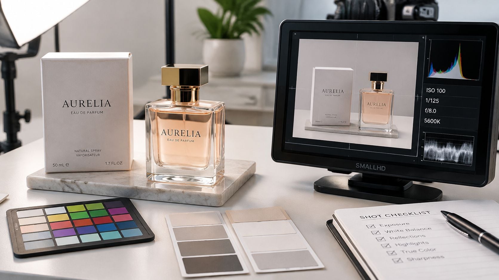
Protect product identity
A neutral, evenly exposed product photo makes a better reference than a dramatic source with harsh white patches across glossy packaging. The editor should compare the original and result for:
- Logo and packaging color: Brand marks and printed panels shouldn't acquire a new hue.
- Material finish: Brushed metal shouldn't become mirror-like, and matte plastic shouldn't appear lacquered.
- Transparent parts: Glass, clear caps, and liquid boundaries should remain distinguishable.
- Highlight shape: Reflections should fit the apparent surface rather than flatten or distort it.
- Cast shadows: Their direction should agree with the other visible lighting cues.
A changed logo color is a failure even when the result looks more striking. Color-critical listings warrant external review against a physical sample or approved product reference.
The relevant starting destination is Enhance product photo. For motion concepts, Assembling product and UGC ads are task-specific destinations, not evidence that either exposes a relighting control. Their current inputs and controls need checking before a lighting workflow is chosen.
Review motion across the full clip
A strong still frame doesn't establish video consistency. Work presented at CVPR 2025 addresses temporal flicker and discontinuities in video relighting, where illumination, shadows, and reflections must remain coherent over time.
Review should cover moving edges, faces, reflective packaging, windows, and shadow boundaries throughout the clip. Brightness that pulses without a visible cause, reflections that jump, or shadows that detach from objects are rejection signals. Nim's product-video guide provides context for planning the broader motion task.
Real footage needs a capture check too. Sony's flicker guidance recommends 1/50 or 1/100 second at 50 Hz, and 1/60 or 1/120 second at 60 Hz, while noting that fast-flickering LEDs may not be fixed by shutter choice alone.
Product identity outranks visual mood. A restrained, stable clip is safer than a striking result that changes the product or pulses.
Confirm the Lighting Before You Publish
Publication starts with a decision, not another generation. The selected result should answer the following questions clearly enough that another reviewer can reach the same conclusion.
Apply the release questions
- Does the result match the written target? The intended daylight, evening, or night state should be apparent through direction, warmth, and the relationship between interior and exterior brightness.
- Do the artifact checks pass? Window boundaries, shadow logic, geometry, and neutral surfaces should withstand close inspection.
- Do product color and motion hold? Commercial details should remain recognizable, and a video should stay consistent throughout its playback.
Passing these checks makes the result ready for internal review, not automatic publication. For a property sequence, Nim's room-tour guide provides context for checking how the selected visual fits a walkthrough.
Route failures to the right fix
A mismatched mood belongs with Pick the Lighting State Before You Generate. Blank windows or competing sources belong with Prepare a Source Image That Holds Its Light. Local visual defects belong with Check the Result for Four Artifacts, while product or temporal failures belong with Verify Product and Video Lighting Before Use.
The output illustrates a lighting treatment, not a measured record of a room, a product's true appearance, or a property's actual light. That distinction should remain clear in any presentation where viewers could otherwise mistake the visualization for documentary evidence.
The next action is specific: prepare a source for Sunlight when natural illumination is the target, or open Day and night for a daylight-to-evening change. The original should remain beside the result during review.
Nim offers video styles and creation categories including UGC, Keyframes, Motion transfer, Animations, Cinematic, Timelapse, Celebrity selfie and Fashion videos. Visit Nim to choose a relevant creation workflow, begin with a prepared source, and judge the lighting change against the original before using it.
- change the lighting
- AI lighting edit
- Nim templates
- relight image
- day to night