How to Color Correct Photos Using Nim AI Templates
Learn how to color correct photos with Nim's Image Enhancer and Enhance Product Photo templates. Step-by-step workflow, input prep, and review tips.
By Nim

A batch of product photos looks ready until the white packaging appears yellow and the red fabric shifts toward orange. To color correct photos reliably, the photographer should prepare the source first: check exposure, neutralize unwanted lighting casts, and only then use an enhancement template. A cleaner-looking generation isn't automatically a more accurate representation of the product.
Why Color Correction Starts Before You Generate
White balance removes an unwanted color cast so objects that should appear white or gray remain neutral. It addresses the color of the illumination, not the intensity of the product's color. Typical light-source temperatures include approximately 2,500–3,500 K for household tungsten, 4,000–5,000 K for fluorescent lamps, 5,000–5,500 K for flash, 5,000–6,500 K for clear-sky daylight, 6,500–8,000 K for overcast conditions, and 9,000–10,000 K for shade, as explained in this white-balance guide.
A warm cast on white packaging therefore needs a lighting correction before a saturation adjustment. Making the orange-looking package more vivid strengthens the wrong appearance. An enhancement also shouldn't be expected to establish the object's true color when the photograph provides an ambiguous reference.
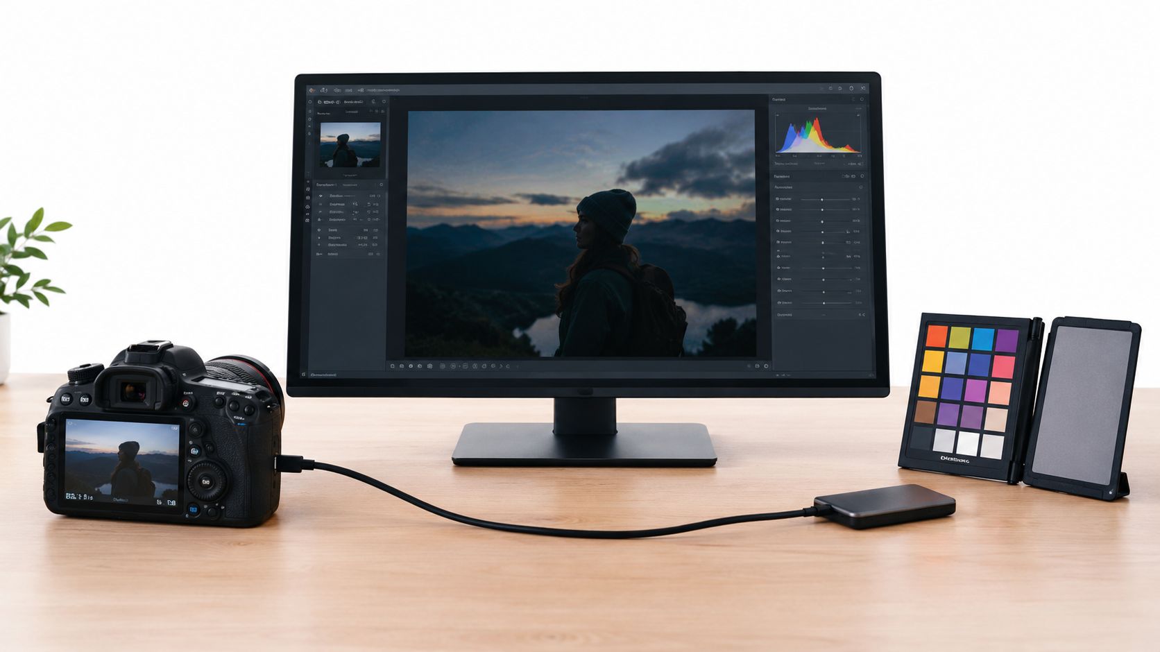
Separate Lighting Errors From Object Colors
The useful question is whether the apparent color belongs to the subject or its surroundings. A cream carton should remain cream; a white carton photographed under warm light shouldn't become cream by accident. The source needs enough trustworthy visual information to distinguish those situations.
Before preparing a batch, the photographer should establish:
- The intended appearance. A neutral catalog photograph and a warm lifestyle advertisement have different acceptance criteria.
- The reference subject. White packaging, gray fabric, or an approved product swatch provides a more useful check than overall attractiveness.
- The lighting consistency. Sources with conflicting casts need individual attention rather than one correction copied indiscriminately.
Set the Standard Before Enhancement
Automatic white balance isn't a guarantee of a usable source. When different parts of a photograph receive different illumination, the photographer must judge each important region rather than trust the overall impression.
Practical rule: Prepare a source that communicates the intended color before asking an enhancement workflow to improve its presentation.
That distinction also matters in ad creative design. A visually striking asset still needs a deliberate decision about which colors represent the merchandise and which belong to the campaign's styling.
Preparing Your Source Photo for the Best Result
Preparation starts at capture or source selection, not with an invented template setting. The product should be visible, unobstructed, and lit consistently enough for its surfaces to be evaluated. A hand covering a label, a curtain reflecting color onto packaging, or a bright glare across fabric can make the image a poor reference even when its composition is appealing.
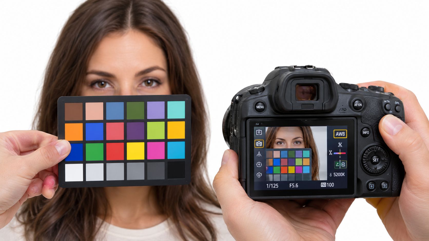
Build a Usable Reference
- Choose an unobstructed view. The source should reveal the color-critical surfaces, packaging, and identifying details. For clothing, that means enough visible fabric to judge the material rather than only its brightest fold.
- Simplify the lighting. A product beside a daylight window and beneath a warm lamp may show conflicting casts. Changing the capture setup is preferable to forcing both sides into agreement afterward.
- Photograph a neutral reference under the same light. A gray card or suitable white surface belongs in a reference shot taken with the subject's lighting, not in a different room or at another time.
- Prefer RAW capture when possible. RAW preserves substantially more white-balance flexibility because photo-rendering operations haven't yet been applied, allowing finishing adjustments after capture, as described in this technical explanation of RAW color processing.
The reference shot and the enhancement input don't have to be identical. The photographer can use the reference to prepare a clean subject image, while retaining the original capture for later comparison.
Correct Detail Before Increasing Color Intensity
In a supporting photo editor, inspect the histogram for clipped highlights or shadows, then adjust exposure and contrast enough to evaluate the subject. Use reversible adjustment layers where supported, and leave saturation until the underlying tonal and color problems are addressed. These practices follow established non-destructive color-adjustment guidance.
Increasing saturation to compensate for underexposure can produce unnatural edges and blocked color channels rather than restore believable color. Likewise, a global adjustment may exaggerate colored reflections from nearby furnishings instead of removing them.
- Keep the original. Save an untouched reference rather than repeatedly replacing the same source.
- Group by capture conditions. Review photographs from the same lighting setup together, but check individual exceptions.
- Prepare for the deliverable. A product-focused source suits Enhance Product Photo; a broader scene may suit Image Enhancer.
For teams developing AI product images, the dependable habit is straightforward: preparation establishes the reference, and enhancement follows it.
Choosing Between Image Enhancer and Enhance Product Photo
A marketplace listing and a lifestyle campaign may use the same object, but they don't ask the image to do the same job. In the listing, the merchandise needs to remain identifiable and visually faithful. In the campaign, the broader scene may matter as much as the product.
Nim's Image Enhancer and Enhance Product Photo provide relevant enhancement workflows for these different tasks. The distinction below is a practical selection guide, not a claim that either template offers calibrated color measurement or particular manual color controls.

Picking the Right Nim Template for Your Image
| Deliverable | Recommended template | Why it fits |
|---|---|---|
| Marketplace listing | Enhance Product Photo | The product itself is the primary subject and acceptance reference. |
| Product-led advertisement | Enhance Product Photo | Presentation needs to support a recognizable, consistent item. |
| Website hero centered on a SKU | Enhance Product Photo | The merchandise remains the main visual commitment. |
| Portrait or lifestyle photograph | Image Enhancer | The task concerns a broader image rather than isolated product presentation. |
| Blog header or varied social imagery | Image Enhancer | General scene enhancement is the more relevant starting point. |
Choose by What Must Stay Stable
For a red handbag on a plain background, product identity takes priority. An enhancement that makes the bag look richer but changes its apparent shade isn't suitable merely because the background and contrast look better. Enhance Product Photo is the relevant workflow to try, followed by a strict merchandise review.
For a lifestyle photograph featuring a bag in an outdoor scene, Image Enhancer is a reasonable general-purpose starting point. The photographer still needs to protect important details, but the acceptance decision also considers whether the scene remains coherent.
A mixed campaign shouldn't automatically use one template for every asset. Product close-ups can follow the product-focused route, while environmental photographs can follow the general enhancement route.
Template choice establishes the job. It doesn't replace the reference photograph or the final color check.
The comparison image illustrates editing concepts, not verified controls inside either template. Photographers should use the inputs and controls present on the selected template rather than assume that a temperature slider, tint setting, or automatic batch option exists.
Running the Nim Workflow From Upload to Download
The generation stage should begin with a prepared image and a clear acceptance standard. A catalog asset might require stable packaging color and intact label details; a lifestyle asset might allow atmospheric warmth while preserving the subject's identity. Defining that standard beforehand prevents an attractive preview from becoming the only criterion.

Provide the Prepared Input
- Open the selected template. Choose the product-photo workflow for product-centered presentation or the general enhancement workflow for a broader image.
- Provide the source requested by the template. Use the prepared photograph as the image input, following the requirements shown on the current form. Keep the untouched reference separately.
- Generate with the available controls. Use only the options displayed. There's no need to assume a prompt field, white-balance control, export preset, or other setting.
- Review before downloading. Inspect the generated image against the intended deliverable, then download an accepted result through the available download option.
The supplied screenshot provides app context, not evidence that every template shares identical controls. File requirements, form details, and available options should be checked where the selected workflow requests its input.
Keep Generation Separate From Measurement
The practical sequence is short, but the review shouldn't be rushed. No fixed rendering time or speed comparison is established for these workflows, so production schedules should leave room for inspecting the result and revisiting unsuitable sources.
When a correction is still needed outside the template, neutral-point selection provides a useful method. In a supporting color editor, select a neutral gray or white area rather than glare or clipped white, then refine temperature along the blue-yellow axis and tint along the green-magenta axis, following this neutral-reference correction guidance.
- Avoid repeated guesswork. If the source's intended color is unclear, another generation doesn't resolve that uncertainty.
- Keep the reference accessible. Compare the creation with the original and the prepared source, not only with the previous generation.
- Treat the output appropriately. An enhanced product or interior image is a visual creation, not a calibrated measurement or verified record of physical conditions.
For daily production batches, consistency comes from applying the same preparation and review standards. It shouldn't be confused with an unverified claim that the templates process multiple photographs together.
Reviewing the Before and After Like a Professional
The first review should target known surfaces, not overall vividness. White packaging and gray textiles can reveal a remaining cast; skin should be checked against the subject's complexion rather than treated as a neutral gray reference. Material colors also deserve attention, because a polished result can still change the perceived character of wood, fabric, or coated packaging.
For e-commerce imagery, compare important colors against the physical item or an approved brand swatch, not just the monitor. Device profiles help interpret color across a workflow, but correction cannot guarantee identical appearance on unmanaged displays or print devices, as explained in this overview of color profiles.
Inspect the Areas That Affect the Purchase
- Neutrals. Check whether white and gray surfaces acquired unwanted yellow, green, blue, or magenta.
- Distinctive colors. Compare the merchandise's defining shades with the approved reference.
- Edges and material detail. Enlarge labels, seams, folds, and reflective surfaces enough to spot distracting color changes.
- The complete image. Compare the untouched source, prepared input, and generated result side by side.
A photographer should also inspect the asset in a representative viewing environment. That check can reveal a practical presentation problem, but it doesn't turn a consumer display into a calibrated reference.
Accept, Regenerate, or Return to Capture
Accept when the output serves the deliverable and preserves the important subject colors. Regenerate when the source is trustworthy but the particular result introduces an unwanted change. Return to preparation or reshoot when conflicting illumination, glare, or missing detail prevents a confident judgment.
Acceptance test: Better presentation is useful only when the image still represents the intended subject.
For browser delivery, converting or exporting through a supporting editor into sRGB, with its profile embedded where available, is a sensible interoperability step because sRGB is the Internet's standard default color space, according to this web color-space explanation. This is an external preparation or finishing recommendation, not an assertion about template export settings.
The review standard matters more than accepting the first polished result from an AI product photo generator. Retaining the untouched reference makes disagreements about color easier to resolve.
Knowing When to Keep the Cast and When to Fix It
A warm interior can suit a lifestyle image, while the same cast may misrepresent a catalog item. For product work, keep merchandise colors faithful: a red dress should read as red, and warm wood should retain its warmth. Choose the correction based on the image's job and the reference you captured.
Judge the Cast Against a Neutral Reference
Use the light-source temperature ranges introduced earlier as starting points, then assess the result against your neutral reference. White balance helps correct an unwanted cast, but removing every trace of warmth or coolness can erase the intended atmosphere.
For clothing portraits, check that complexion and fabric colors still work together. The guide to identify your undertone with Cedar & Lily offers styling context, though it is not a technical calibration reference.
Preserve intentional atmosphere while keeping product color credible.
The Sunlight and Day and night workflows suit atmosphere-led image creation. Property transformations produced with these workflows are illustrations; they do not document a property's actual lighting or condition. Keep or correct a cast according to the intended result.
For prepared source photographs, Nim offers Image Enhancer and Enhance Product Photo. Choose the workflow that fits the deliverable, then compare its result with an untouched reference before publishing. A practical white-balance reference can provide further guidance.
- color correct photos
- AI photo enhancement
- Nim templates
- product photography
- white balance