How to Do Photo Color Grading Without Ruining Your Colors
Learn photo color grading step by step: prepare the source, use Nim's Image Enhancer, check skin and product colors, and know when to finish externally.
By Nim
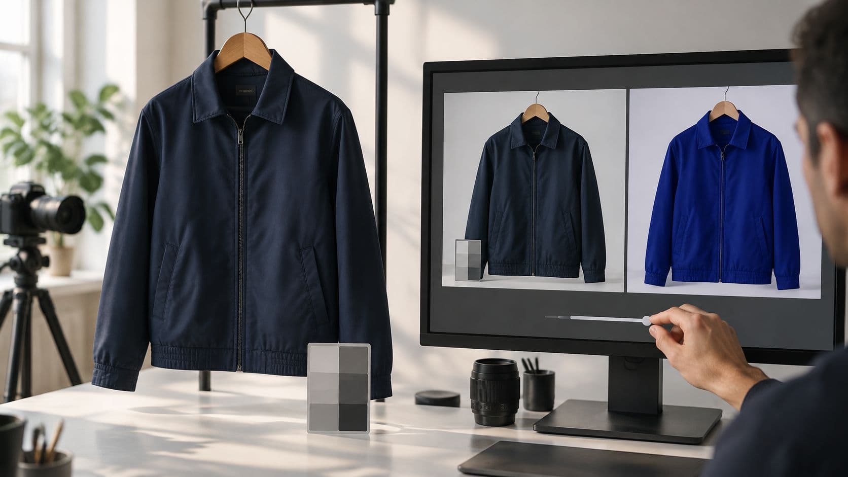
A seller finishes editing a navy jacket, places the image beside the product, and notices the problem: the photograph looks polished, but the fabric now looks royal blue. Photo color grading should preserve the product's color before adding mood. The dependable approach is to correct exposure, white balance, and unwanted casts first, then keep a neutral listing master separate from a restrained advertising version.
Photo Color Grading Order at a Glance
A photographer can follow this default order on almost any product photograph:
- Exposure and tonal range. Establish usable brightness and contrast while retaining highlight and shadow detail.
- White balance. Adjust temperature and tint using a photographed neutral white or gray reference.
- Color casts. Resolve remaining contamination from mixed lighting or nearby colored surfaces.
- Creative look. Introduce deliberate contrast, saturation, or warmer and cooler environmental tones.
Photo color grading stages and the check for each
| Stage | What you adjust | What to check |
|---|---|---|
| 1. Exposure and tonal range | Brightness, contrast, highlight and shadow levels | No clipped highlights or crushed shadows |
| 2. White balance | Temperature and tint from a white or gray area | Neutral backgrounds and whites look neutral |
| 3. Color casts | Tint from mixed or colored light | Skin and product colors match the physical reference |
| 4. Creative look | Contrast, saturation, warm or cool tone | Subject and product hues are unchanged |
Why correction comes before style
Each later adjustment acts on the image left by the previous stage. Strong saturation can exaggerate a slight green cast; deeper contrast can conceal detail in dark fabric that was already underexposed.
A controlled-environment imaging paper published by Wiley describes a pipeline of flat-field correction, gamma correction, white-balance correction, and color mapping. That technical sequence supports the practical principle: illumination and tonal problems need attention before creative color mapping, although it isn't a literal recipe for every consumer photograph.
Practical rule: An attractive preset isn't evidence that a photograph is correctly balanced.
The first diagnostic question is whether the source contains usable detail. A white cosmetic carton needs visible edges and printing, while a black handbag needs distinguishable seams and material texture. If those features disappear before styling begins, a dramatic look won't restore them.
A completed stage also needs a clear stopping point. Neutralizing a background shouldn't turn a cream-colored product white, and lifting shadows shouldn't make black fabric gray. Capture lighting, the camera profile, and the accuracy of the reference determine how far correction can go, so the sequence supports reliable decisions rather than guaranteeing a faithful result.
Prepare the Source Photo Before You Grade
Accurate grading starts beside the product, not at the editing screen. A clean source lets the photographer distinguish an actual material color from a lighting problem. That clean frame also becomes the neutral, reference-matched master for listings, while a restrained campaign variant for ads gets graded from it later.
The workspace image illustrates a capture-and-review setup; it isn't evidence of a Nim interface or a verified output.
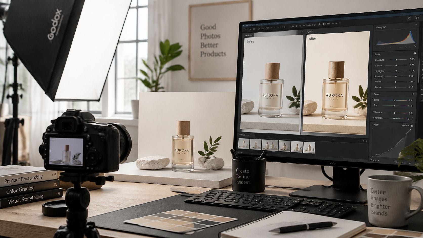
Build a repeatable capture setup
- Light evenly. A diffused window or softbox provides a controllable starting point. Switching off tungsten room lights prevents competing illumination from reaching opposite sides of the item.
- Photograph a neutral reference. A gray card belongs under the actual product lighting, either within a reference frame or in a separate exposure made immediately before the set. A downloaded gray patch can't document the light in the room.
- Capture RAW when available. RAW offers more latitude for white-balance correction than a JPEG with an incorrect balance already applied.
- Keep the setup fixed. Light position, camera settings, and reference placement should remain consistent across the collection.
- Prepare the viewing environment. A calibrated display and an sRGB web-export plan provide a more dependable basis for evaluating listing images.
These habits share one principle: consistent capture, a documented neutral, and color-managed viewing. On the lighting side specifically, Nim's guide to changing the lighting in an image explains how direction and quality of light shape the starting frame. Input preparation happens at capture; the enhancement template does not set lighting for you.
Common light sources and the cast they cause
| Light source | Typical shift | First fix |
|---|---|---|
| Tungsten bulbs | Orange cast on skin and whites | Set white balance from a gray card under the same light |
| Mixed daylight and tungsten | Skin shifts toward orange or blue | Use one light type for the whole set |
| Shade | Blue cast on skin and products | Set white balance from a gray card in the same shade |
| Green-tinted window | Green cast on skin and neutrals | Move the subject away from the window or use diffused light |
| Colored walls or surfaces | Color spill onto skin and product edges | Move the item away from the surface before shooting |
A mixed-light cast is primarily a capture problem. When opposite edges need contradictory corrections, changing the lighting is more dependable than pushing global sliders.
Before photographing the collection, run a single test frame through the full setup and inspect it on the calibrated display. If whites drift or shadows block up, adjust the lights and reshoot that one frame. Correcting the same fault across every listing costs far more time than fixing it once at the source.
Run the Image Enhancer on a Test Set
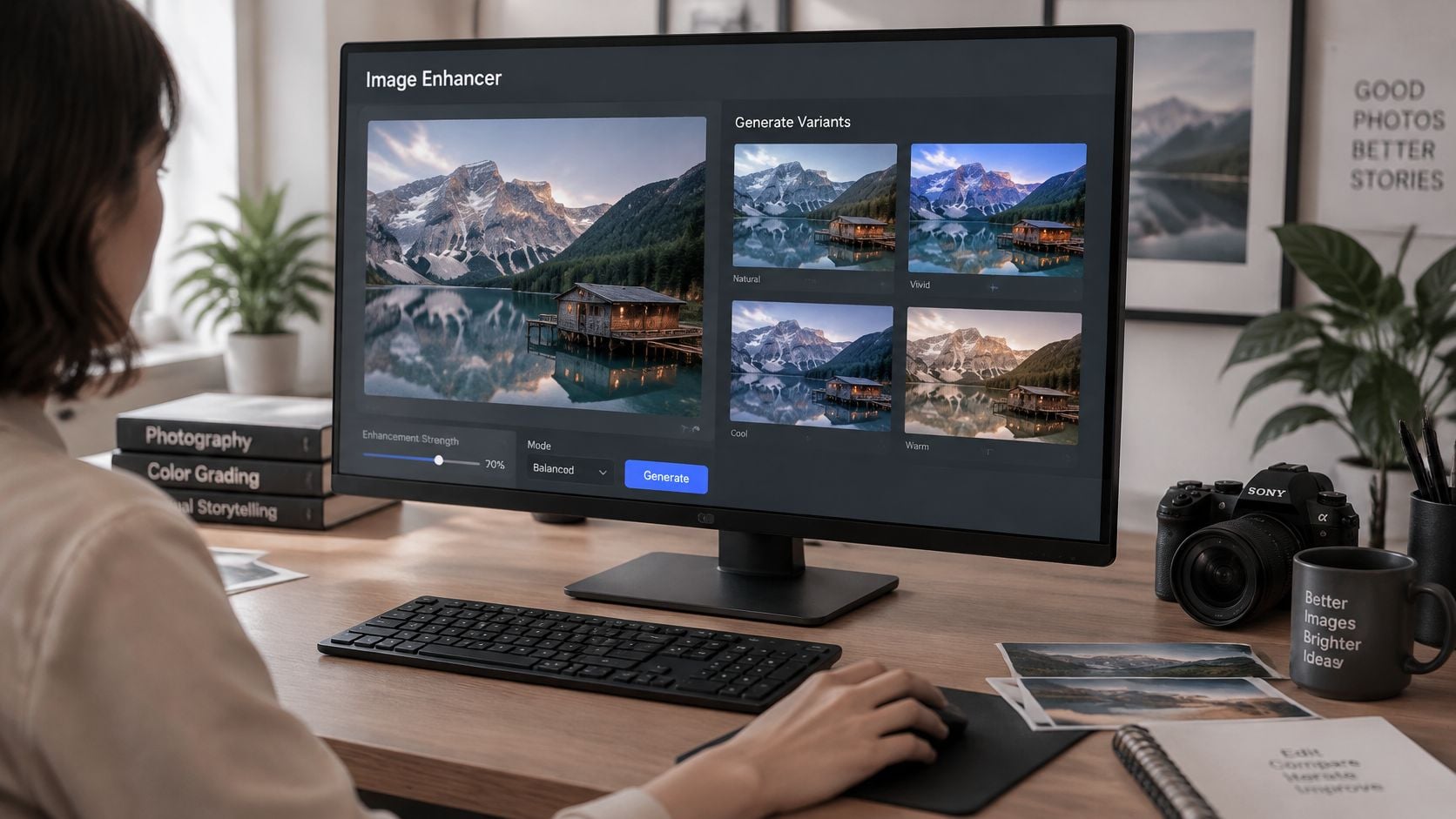
A navy jacket beside a gray card makes a useful enhancement test. The output may look cleaner or more polished, but the jacket still needs to read as the same navy, with the same relationship between its fabric, stitching, and trim.
Generate a candidate, then evaluate it
- Choose the relevant workflow. The photographer opens Image Enhancer for general enhancement, or Enhance Product Photo for listing-oriented product work.
- Provide the prepared source. The current template page determines any additional requested inputs; unlisted fields or manual grading controls shouldn't be assumed.
- Generate a candidate. Treat the output as a proposal that still needs review.
- Compare against the original. Check highlights, dark material, whites, the product's hue, and any gray background for unwanted shifts.
- Resolve a failed comparison. If the source has uneven lighting or contaminated neutrals, correct the capture setup rather than applying a stronger look.
- Download only a passing result. A visually appealing output that changes the merchandise color isn't suitable as a listing master.
Enhancement here means generation and review. Curves, hue controls, masks, and selective corrections belong to a separate editing step once a candidate passes.
Select images that expose weaknesses
Three to five photographs from the same shoot are enough to show whether the workflow can be trusted. The set should include the most saturated item in the collection, a dark or reflective material, and a person wearing or holding the product when lifestyle imagery is part of the campaign.
Each choice targets a different failure. A bright red package exposes excessive saturation. Black fabric reveals lost shadow separation. A face makes an environmental cast easier to notice, and a beige carton turns a slight green or magenta shift obvious at listing size.
Compare each candidate with its original side by side. The source photograph shows exactly what the enhancement changed, which keeps an attractive but inaccurate result from slipping through.
For close inspection, use full-size magnification in a suitable viewer or editor, then check the image again at its likely listing size. Magnification exposes edge contamination and damaged detail; the smaller view shows whether the overall presentation makes the item appear lighter, darker, or more saturated than expected.
Use a clear acceptance decision
- Pass. The product retains its recognizable hue, labels remain believable, neutral areas stay consistent, and material detail survives.
- Capture failure. The original already contains conflicting casts, missing detail, or uneven illumination. The lighting or exposure needs correction before another generation.
- Output failure. A sound source produces altered fabric color, tinted packaging, or inconsistent background whites. That candidate should be rejected rather than defended because it looks attractive.
- Creative-only candidate. An appealing result that changes the item's appearance stays out of the master files used to establish merchandise color.
For the navy jacket, a bluer output warrants a specific diagnosis. If the gray card also becomes blue, the shift is broad; if the card remains neutral but the jacket changes, the problem is selective. Reshooting helps a faulty source, while a changed output alone calls for generating a new candidate.
Nim's guide to AI product images offers context for planning product visuals. For color-sensitive work, approval still belongs to the seller comparing the candidate with the merchandise.
The test set should pass as a group before the workflow is used across the collection. Otherwise, individually attractive images can leave a storefront with inconsistent whites, mismatched garment colors, and no dependable visual reference.
Check Skin, Neutrals and Product Colors
A polished photograph can still misrepresent the subject. Objective checks separate an intentional atmosphere from accidental contamination, especially when a lifestyle image contains skin, white packaging, and colored merchandise together.
Inspect in a useful order
Start with the histogram. Look for blocked shadows and clipped highlights, then examine the corresponding areas of the image. A histogram flags a tonal problem; the picture reveals whether it affects an important label, face, or material.
Skin hue comes next. In an external editor with a vectorscope, the skin-tone line gives a hue-direction check rather than a fixed brightness target. PHLEARN's photo color-grading guidance supports checking skin against that hue direction while protecting critical subject colors during selective grading. Different complexions shouldn't be forced into an identical brightness or saturation just because they share a useful directional reference.
The common failure is a global teal, orange, or magenta shift applied for atmosphere. It can improve the background while making a face look artificial, a white label look cream, or upholstery appear to belong to another colorway.
Separate commercial accuracy from campaign mood
The listing master stays neutral and reference-matched. The campaign variant can carry more environmental warmth, cooler background shadows, or stronger contrast, provided the product still appears to be the item being sold.
For a home-textile shoot, a stylist might browse covers for sofa beds from Casamé Home while planning colorways and room combinations. Use the cover listing as a colorway reference, then photograph your own fabric under the shoot's lighting so the grade judges the actual material.
Approval boundary: Treat every generated candidate as a creative asset that still has to match the physical item before it can stand in for the product.
Compare candidate images under the same display conditions. For an animated product visual, adjacent frames also need inspection: a stable opening frame doesn't justify fabric changing hue during movement.
Use Nim's product picture ideas to choose between a plain listing view and a styled campaign scene, then grade to that purpose without letting the styled scene redefine the merchandise.
A second-screen check can expose an obvious problem, yet it doesn't replace a calibrated reference display. When screens disagree, chasing each screen with another adjustment usually makes the master less dependable.
When to Move the Grade to an External Editor
Move the file to an external editor when the correction has to affect one area or one color range: protecting a face while cooling a wall, adjusting a narrow fabric hue, or preparing a file for a defined output profile. That keeps the generated candidate intact while masks, local color controls, or export profiles address the remaining change.
Grading tasks in Nim and in an external editor
| Task | In Nim | In an external editor |
|---|---|---|
| Clean up and neutralize a source photo | Prepare the source, then run the Image Enhancer; review the result for neutrality | Check levels or curves against a gray reference |
| Keep a product set consistent | Run Enhance Product Photo on each prepared source, then compare the outputs | Review images side by side at full-size magnification on a calibrated display |
| Selective skin or background color | Keep the source clean and compare the full-image result | Use masks and hue, saturation, and luminance adjustments |
| Final web or print conversion | Keep the approved candidate unchanged as the reference file | Convert to sRGB or the receiving workflow's target profile on export |
Keep finishing changes narrow
- Preserve the approved output. Work on a separate version and retain the original photograph, reference frame, and unmodified generated candidate for comparison.
- Correct locally when necessary. A mask can restrict a background adjustment, while hue, saturation, and luminance controls can address a specific color range. Inspect every area where similar colors appear.
- Export for the destination. Web delivery calls for the intended web profile; print delivery requires the receiving production workflow's target profile rather than a guess.
Heavy finishing is particularly risky for branded merchandise, where a small hue shift can change the perceived identity of the item. Keep the physical sample and approved artwork as the color references; if you are sourcing that merchandise, compare bulk branded merchandise options.
Keep each correction on its own version so a skin or background adjustment does not alter packaging, fabric, or logo color. Compare the version against the reference before making another change; several small global shifts can move the product farther from its approved color than one obvious edit.
If the shoot omitted a neutral reference and used mixed lighting, an external editor can't reliably recover the original colors from guesswork alone. A controlled reshoot may be the more dependable fix.
Nim offers image-enhancement and product-photo workflows for turning prepared photographs into creative candidates. Visit Nim with a consistently lit test image, compare the result against the physical product, and approve a neutral listing master before developing the campaign look.
- photo color grading
- color grading tutorial
- product photo colors
- white balance
- Nim Image Enhancer